A Bad Design!
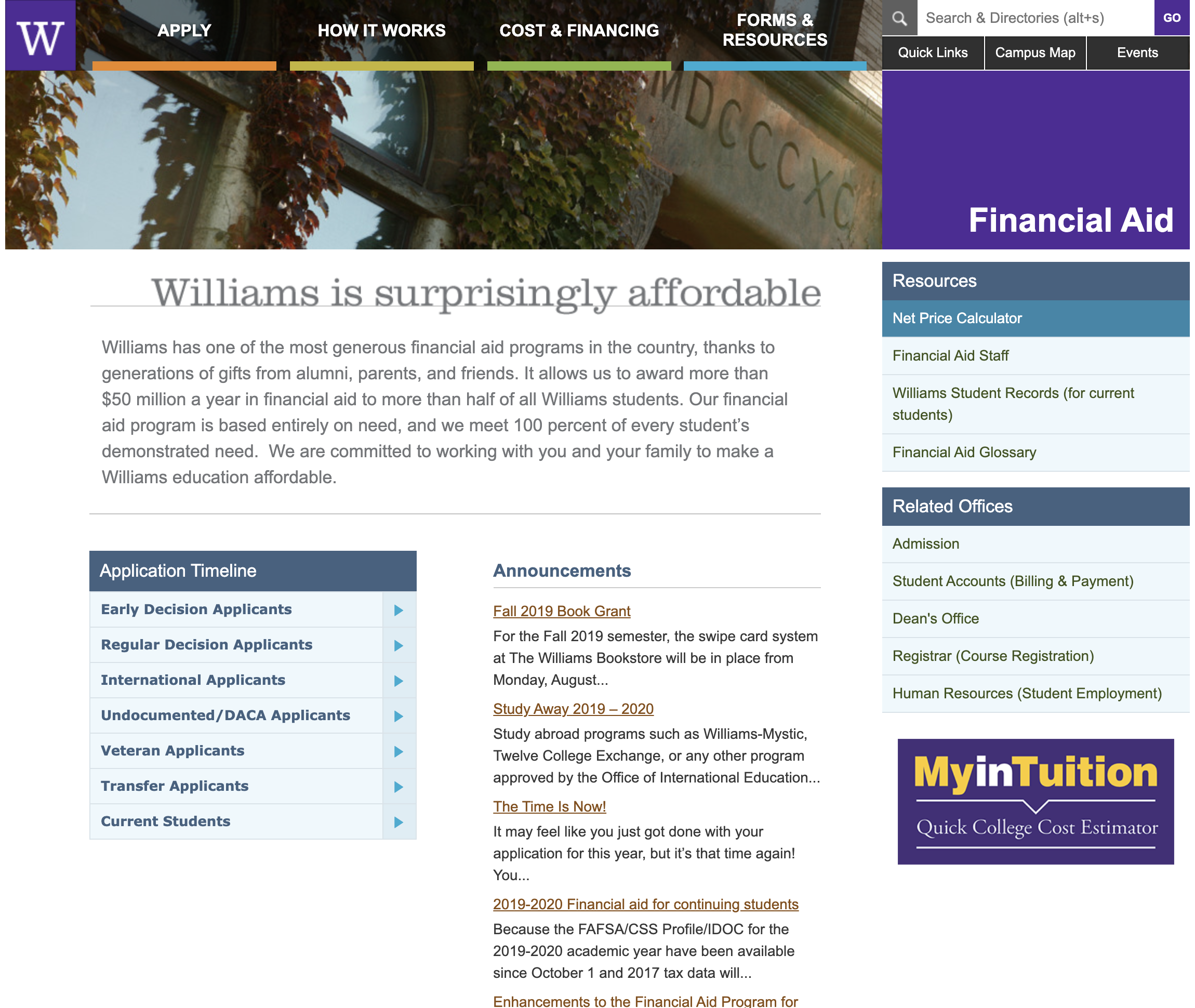
One of the main reasons I find this design to be unappealing is because it does not follow the style and theme of all the other main pages on the Williams website. When I first started critiquing this page, all I was thinking about was uniformness. I also feel as if certain aspects of the page could be rearranged. This website does not follow the “Good Design is as little design as possible” characteristic. I say this mostly because the “Application Timeline” menu could have gone to the right, following the style of the “Resources” and “Related Offices” menu. This would allow the Announcements section to take up more space on the page. This would also open up the option to add an image for each announcement. Also, since the menus are so spread apart, it could become distracting to the user because they have to look at different places to find different menus instead of one place. This aspect takes away from the usability and aesthetics of the site. This might allow users to not find the information they need regarding Financial Aid as quickly as possible. This page could be redesigned to have a simpler look and feel. This will help to improve the usability of the page.
