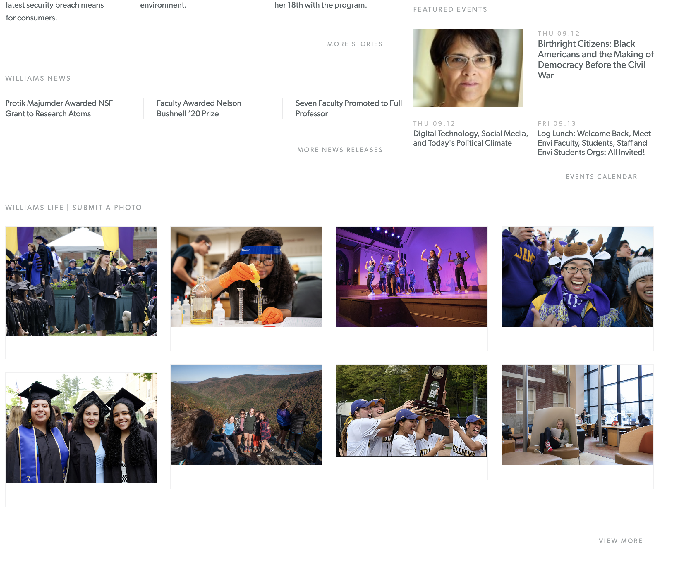
A Good Design!
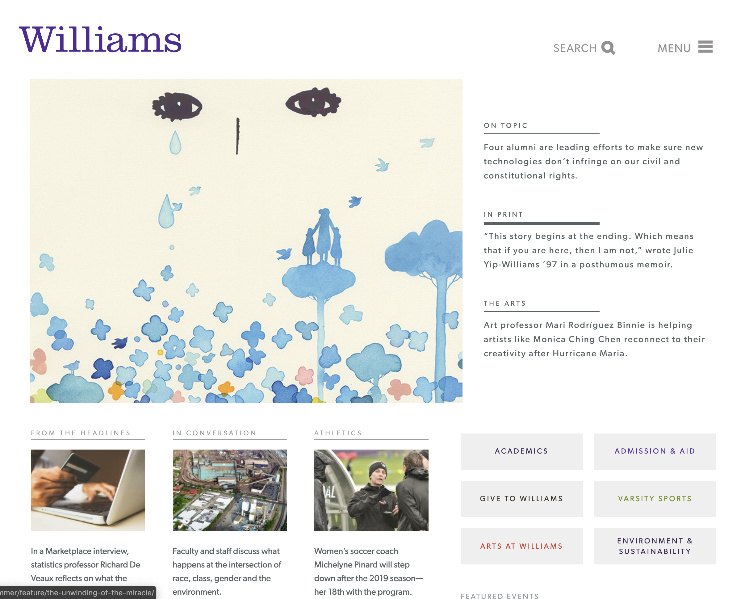
The Williams’ homepage is very aesthetically pleasing to the eyes. It is not complex nor does it have several elements cluttering the page so that it begins to get distracting. With this simplistic design, it allows navigation to feel somewhat easier with a Search and Menu button at the top of the screen. One improvement I would give is that the navigation bar at the top should stay static when the user is scrolling down the page. This will allow them to not worry about having to scroll back to the top if they need to search for something or navigate elsewhere. The designer of this website was perhaps thinking about the homepage as a place where users will be able to see several headlines the college is currently talking about, quick links to frequently visited places on the site as well as graphics they belive depict the culture at the school. This aligns a lot with the characteristic that “Good design is honest”. Our homepage does not put the school in a position where individuals visiting the site could be deceived in some way. I believe that it follows the principles of what good design is. I hope when I visit the website in future it remains this way because it gets the job done and as the old saying goes; Don’t try to fix what isn’t broken.